Lonely Planet Mobile + Desktop Site Redesign
This project is not affiliated with Lonely Planet.
The following work is a conceptual educational exercise to practice and refine UX Skills.
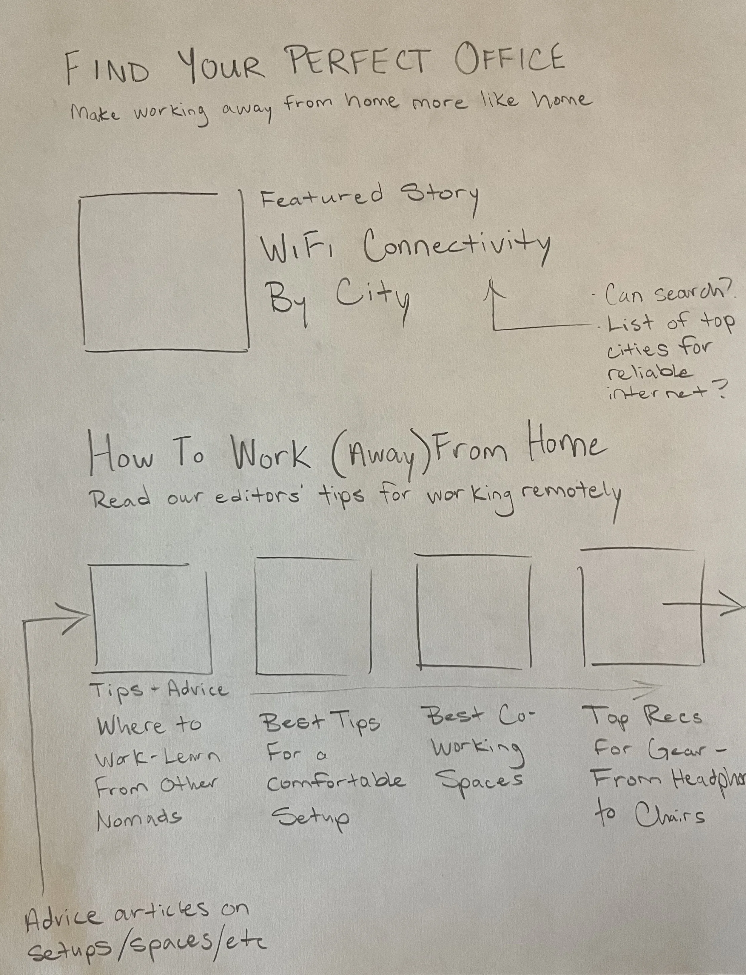
Sketch of possible Digital Nomad landing page
Project Overview
Scope
UX Team: Conor Lockier, Emma Milani, Mark Murphy, Praveena Rongala
My Role: Lead Researcher, Design Support
Timeline: 2 weeks
Brief
Lonely Planet is a travel site that informs and inspires travelers with trusted content through articles and guidebooks from experts who visit every destination.
With the rise of remote work, there has been an increase in the number of digital nomads (people that travel extensively while working remotely from their destinations).
Lonely Planet would like to help them by connecting travel and work. To do this, we need to understand the traveling needs of digital nomads, but first we needed to familiarize ourselves with this unfamiliar territory.
Research
Learning the Competition
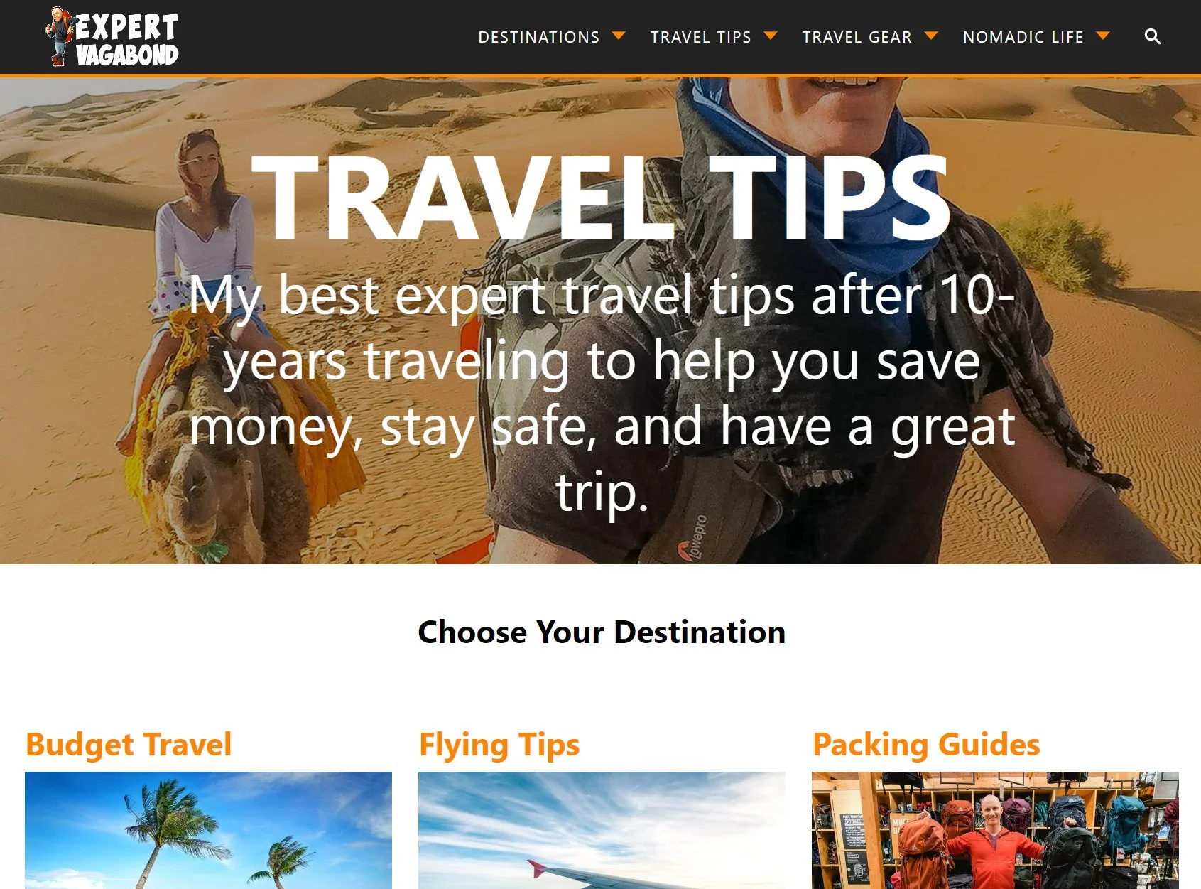
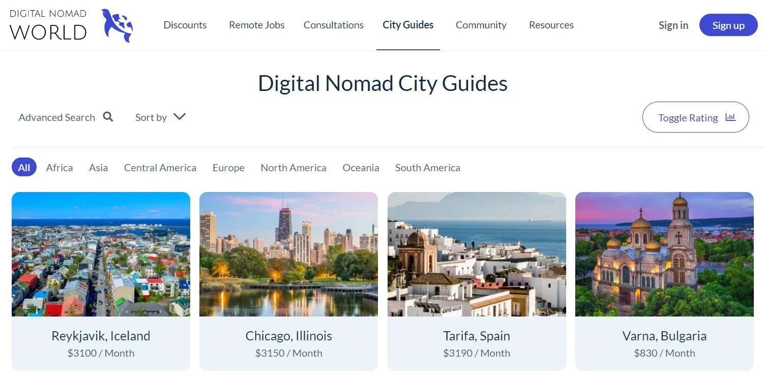
Our team looked at other digital nomad-focused sites to learn about trends in the industry, Lonely Planet’s competitive place in the industry, and analyze what type of content was being offered. None of us were very familiar with this space and needed to find our footing.
Key traits were:
Primary and faceted navigation
Lists of destinations
Articles and information
Chatting with Nomads
To screen for potential interviewees, our team created a screener survey to identify candidates who fit into our target audience. The survey helped us identify candidates who traveled for extended periods of time while working remotely, not just people that might travel for business trips or work remotely for a weekend away. I then conducted 4 user interviews, from travelers in Utah, Kenya, Colorado, and NYC, with the help of our UX team.
Filling in the Gaps
As you can imagine, finding users that fit this description and scheduling interviews across various time zones given the time constraints was difficult; we were starting to worry about gathering enough data to form a solid foundation for our research. During downtime, our team conducted some content analysis across YouTube videos, blogs, and forums to supplemented interviews in case we fell short. Luckily, we secured a decent base of interviews to continue, and found that our interviewees shared many of the same experiences as those we found online:
Key Insights
From our interviews and content analysis, our team synthesized the data through affinity mapping and found these key insights about our user:
Prioritizes comfort in their workspace (one nomad mentioned a friend that they knew who would buy an office chair on Facebook Marketplace and resell it when they left)
Likes connecting with others - meeting up with locals at bars or finding other digital nomads to get recommendations of places to go
Needs stable, reliable internet - not just fast. Some places with fast internet would have the issue of cutting in and out
Plans ahead and includes back up plans (cafes and workspaces to fall back on in case of their internet connection cutting out)
Researches and finds inspiration on mobile devices; serious planning and booking is done on their desktop or laptop.
Our User
Crafting our Persona
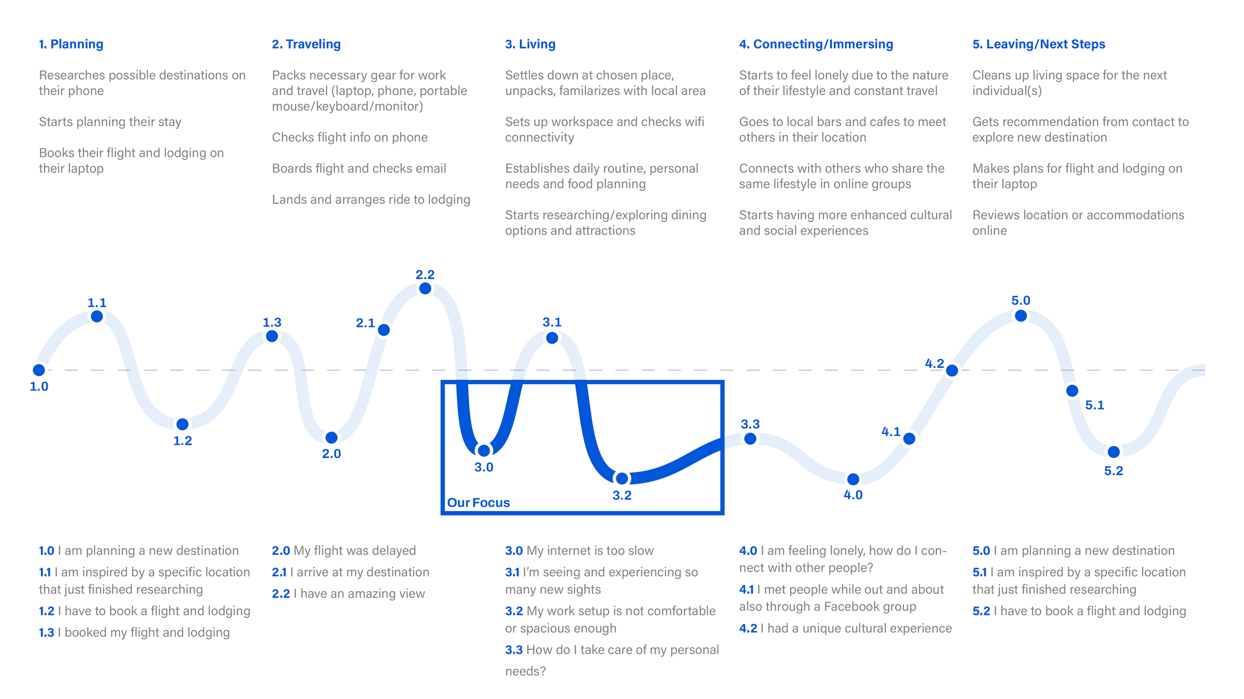
We constructed our user persona from these insights, as well as outlined their journey from planning an upcoming trip through leaving their destination to repeat the process

Crafting Their Journey
Our user, Alex, goes through many ups and downs throughout their traveling experience. We decided to focus in on their pain points during the “Living” section of their journey, as it is the longest and most routine area of their trip - honing in on issues with their workspace.
How might we make their accommodation more conducive to a productive work environment? And how might we also address some of the other pain points that arise while working abroad?
Design
Mapping Our Site
Since Lonely Planet mainly deals in delivering inspirational and advice-filled articles on travel locations from experts that live there, we began brainstorming content that could be tailored to digital nomads and how it would live on the site. We started with creating a separate global navigation section dedicated to digital nomads and their various needs within that: tips for setting up their workspace, the best cafes and coworking spaces to fall back on if their WiFi cuts out, tips on taxes, and how to deal with personal needs and mental health
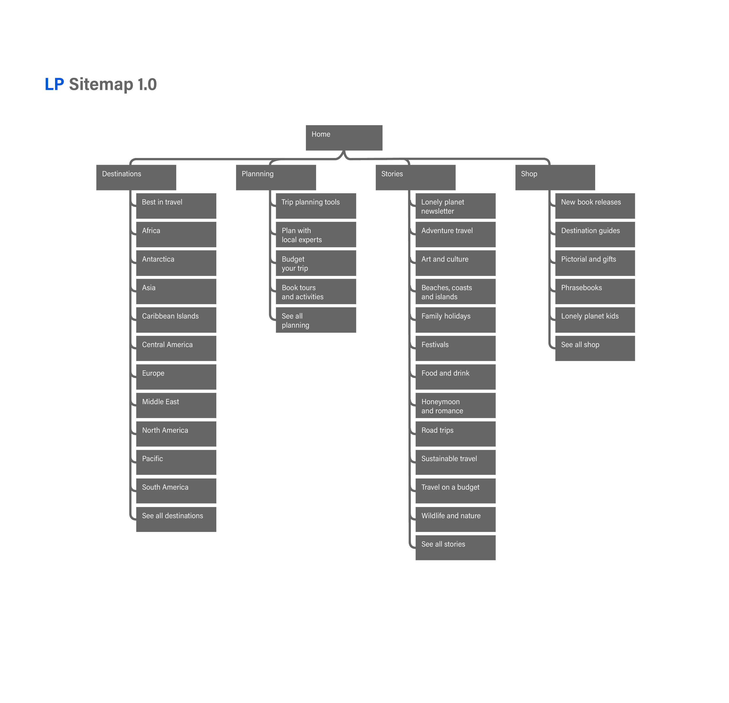
(Original Sitemap)
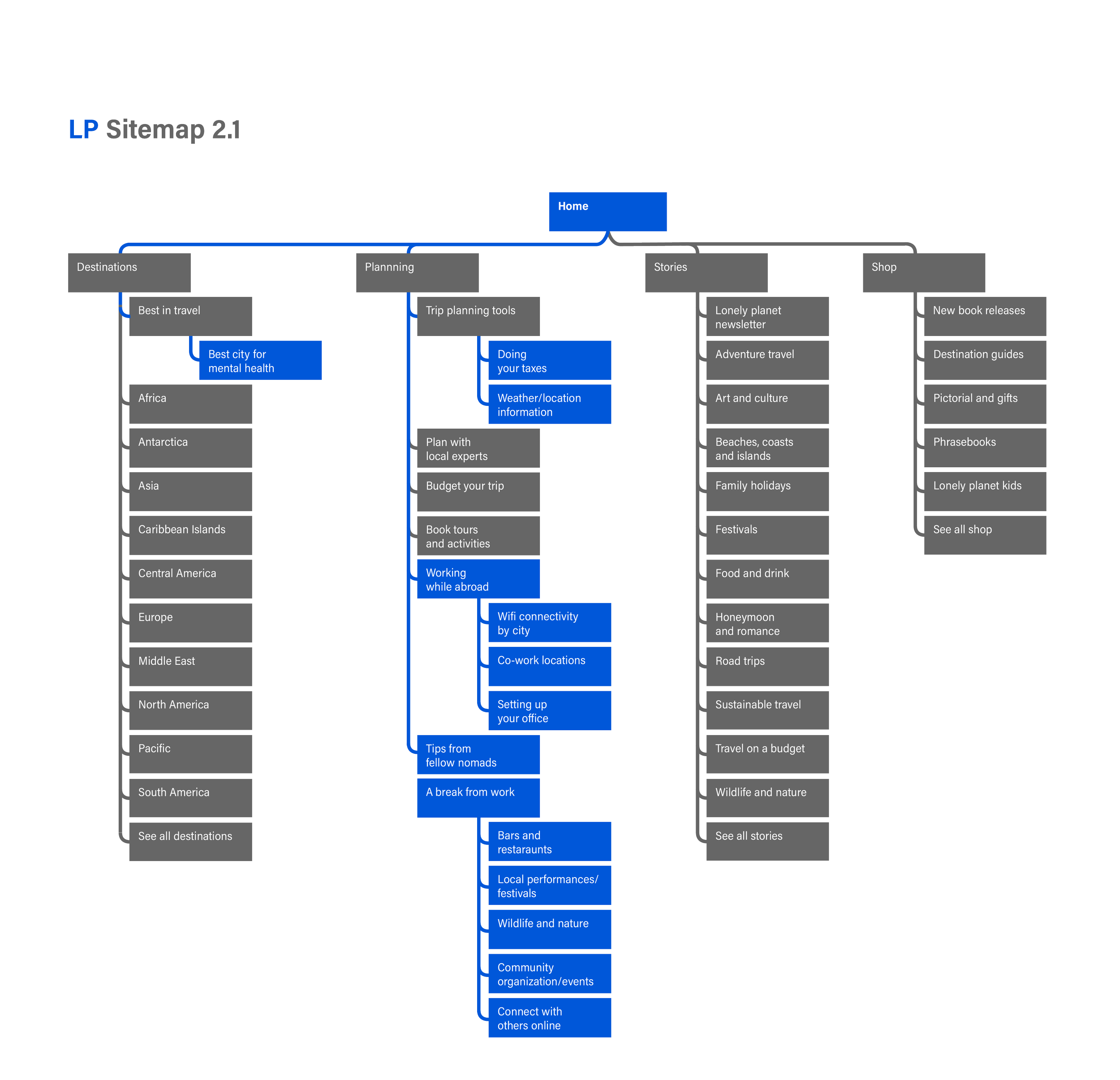
(Proposed Sitemap)

But Can They Find It?
With our proposed content now arranged, we were ready to start sketching our wireframes - but first I thought we should test to see if people would be able to find the content we had in mind in this new navigation. Before moving forward, we conducted a tree test asking users to find certain content within our tab as well as some control tasks within the existing site’s navigation.
Results were not great for our new tab, with success rates of only 43%, 29%, and 10% for finding information about setting up an office space in a particular destination, tips about setting up office spaces generally, and finding cultural events after work.
Looking back, I think we could have done a better job writing our prompts and prepping users for tree tests generally, but with the data we had at hand we decided to move away from our dedicated tab and nest our content within the current site’s navigation:
(Final Sitemap)
Sketching + Wireframes
Now that we had a more solid direction for our navigation, we sketched some possible ways for our users to access this new content. We considered some location-specific articles and how to implement them through some form of faceted navigation that we saw throughout our competitive analysis at the beginning of our research.
We constructed two flows users would take:
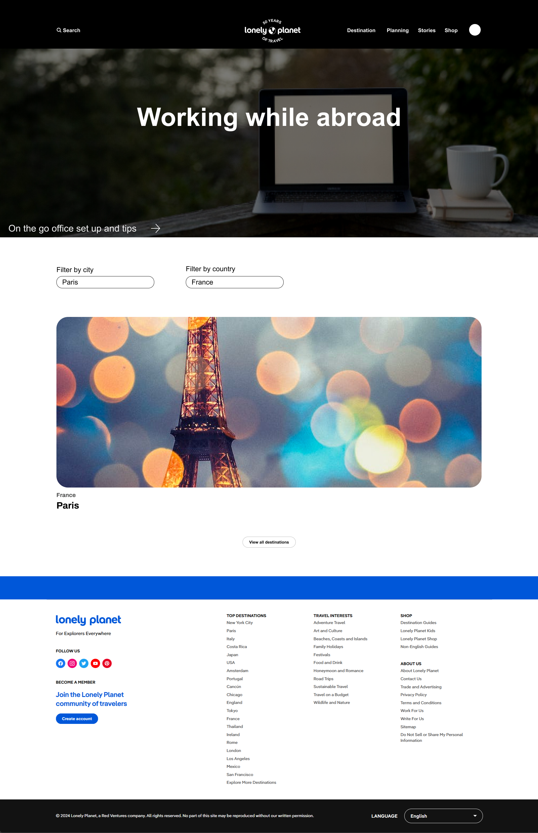
Accessing an article with tips for setting up an office space in Paris (which would also bring you past some backup plans for working at cafes or coworking spaces nearby)
Finding tips for setting up a remote work space generally
Components for wireframing
Usability Testing
We moved on to test our designs with 5 users, who were all able to complete our tasks but had some common suggestions:
Shorten some of the titles to make them more understandable
Give more variety in the tasks, which were far too similar
Refine
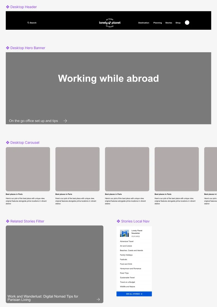
Hi Fidelity Prototypes
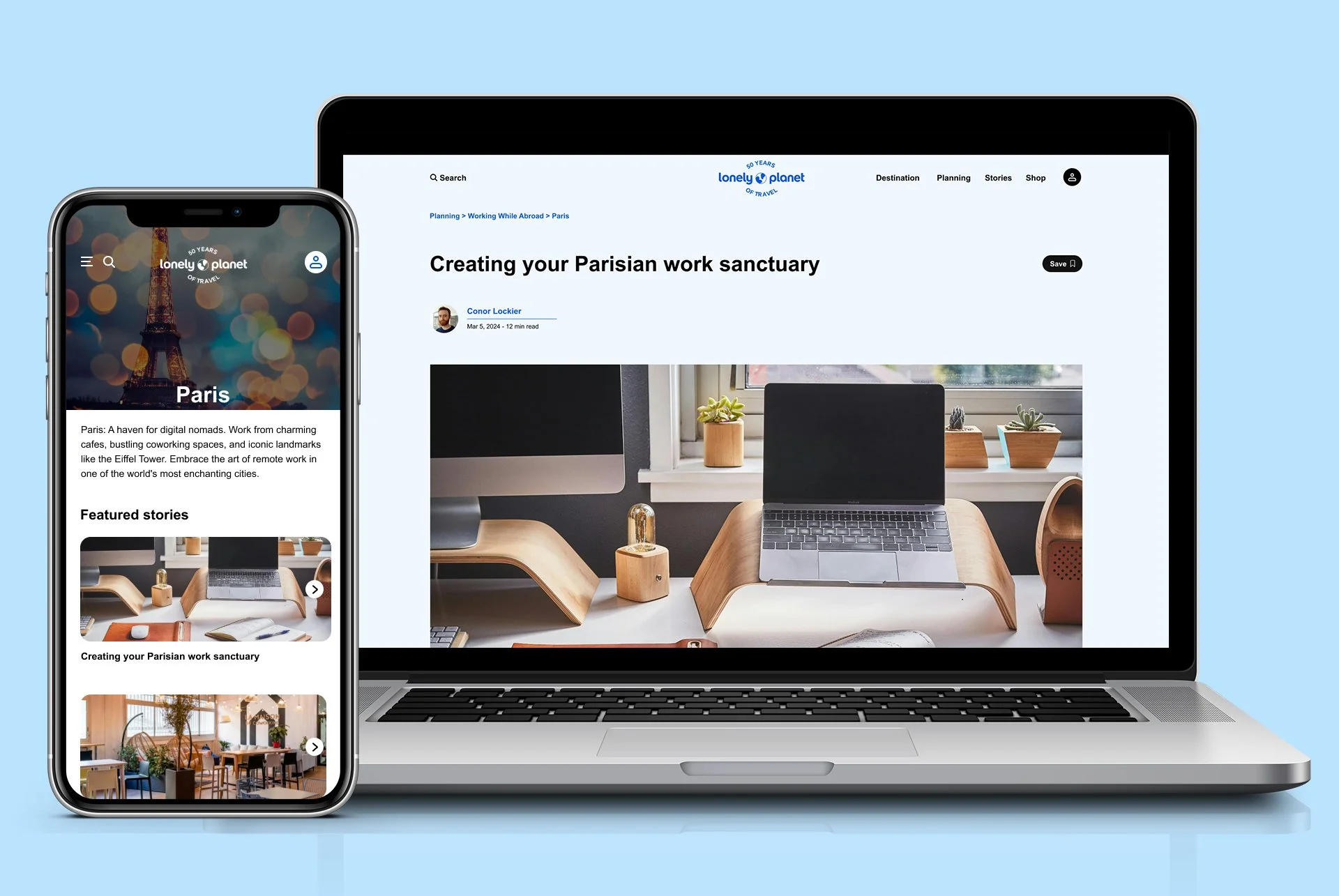
With those considerations, we adjusted our designs and presented our final mobile and desktop iterations. We built out screens for navigating to:
Parisian workspace tips and public workspaces, as well as articles on vetted AirBnb’s ideal for remote work
A more fleshed out “Tips From Nomads” page with articles on finances, community building, general office setup tips and dealing with mental health on the road
You can view those prototypes on both mobile and desktop here:

HiFi landing pages
Reflections + Next Steps
Prompt writing is important, and there’s only so many problems you can address in a short period of time.
Working with a team requires trust and communication.
Would build out more on these areas - tax tips, community, etc
If successful, would consider creating a Digital Nomad’s Guidebook to sell alongside Lonely Planet’s robust collection of expert guides