Octopus Records E-Commerce Desktop Redesign
This project is not affiliated with Octopus Records.
The following work is a conceptual educational exercise to practice and refine UX Skills.
Project Overview
Scope
My Role: Solo UX Generalist (competitive analysis, interviewing, usability testing, affinity mapping, sketching, wireframing, prototyping)
Timeline: 2 weeks
The Problems
In addition to some accessibility issues, users are struggling to navigate parts of the site to find new music that they might enjoy, losing potential sales.
The Solutions
Increasing contrast and legibility of icons, as well as adding track lists and song previews to keep users engaged onsite. They no longer have to open a new tab to listen to music they’re unfamiliar with, which risks them not returning to complete a sale
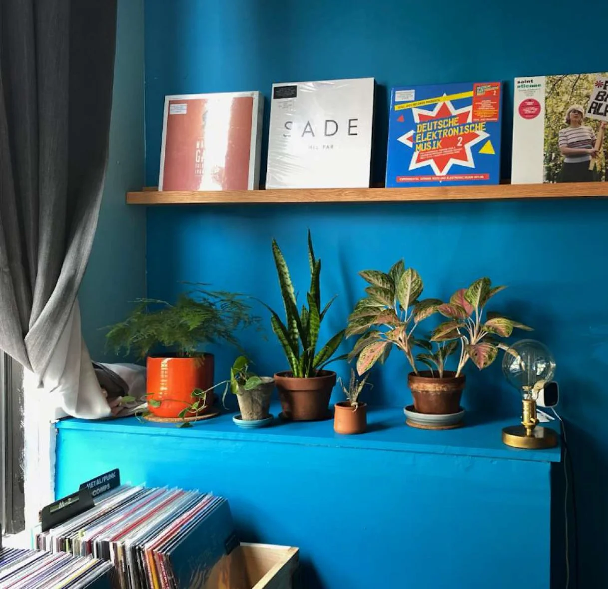
Octopus Records interior
Brief
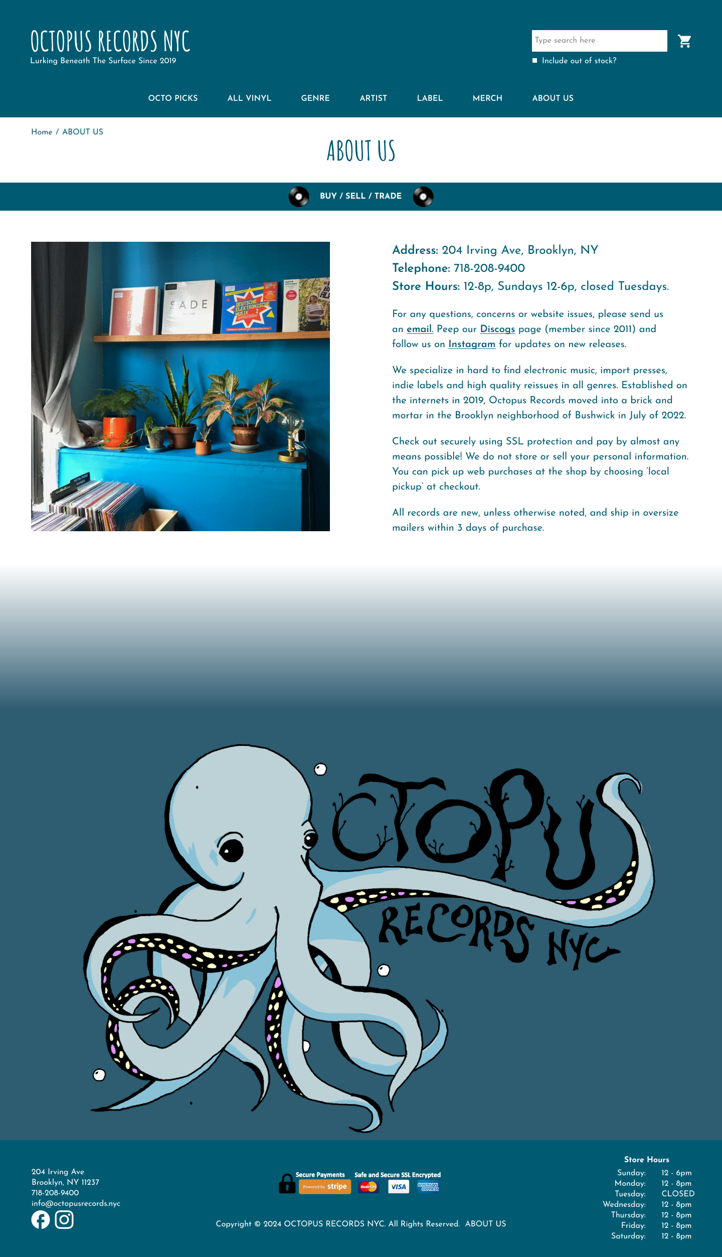
Octopus records is a small record shop in Bushwick, Brooklyn. They specialize in hard-to-find electronic music, import presses, indie labels, and high quality reissues in all genres - targeting more niche record collectors, but also carry a wide selection to include more casual listeners.
As a local small business, they want to showcase their products while maintaining their brand image: “small shop” appeal and great customer service. Through an improved e-commerce website focusing on their Home Page, About Page, Product Description Page, and Checkout Process Pages, my goal is to help them do just that.
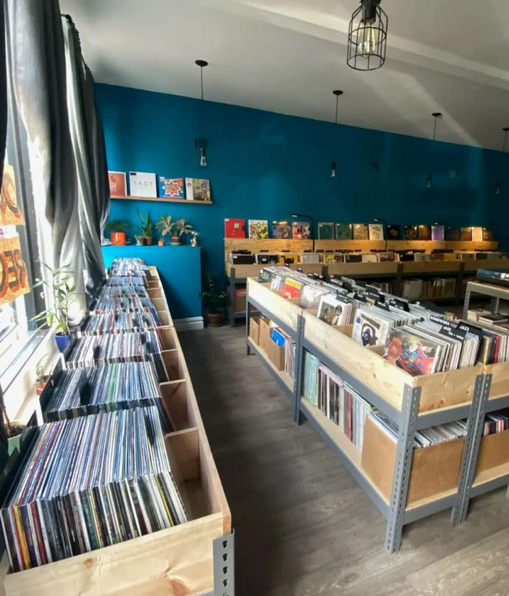
Octopus Records interior
Research
Listening to Our User
To start things off, I reached out to people in my network that I knew listened to and purchased vinyl. I aimed to interview a wide variety of listeners that covered the spread of Octopus Records’ target audience - two vinyl DJ’s, a local musician that mainly seeks out rock and independent artists, and someone that grew up with vinyl and looks for a wide range of genres, but usually steers toward oldies.
Whether they bought records online or in person wasn’t of too much importance to me when recruiting; the online shopping experience should aim to mimic the in-person one. When crafting my interview script, I focused on finding out how people generally shop for records - what they look for, what sections they go to, if they go in looking for something specific or just browse, etc.
After interviewing 4 target users, the key takeaways were:
Two main types of buying behaviors: searching for something specific that they’ve listened to and know they like, or browsing for something that catches their eye and when they listen to it, they instantly know they’ll buy it.
Typically browse based on genre, but also have label and artist loyalty.
Appreciate some form of curation.
Listening to the Competition
In between scheduling interviews with potential users I took a look at some of Octopus Records’ direct competitors to see how they presented their landing pages and what features stood out. Analyzing the home pages, product pages, and filtering options of Rough Trade, Tower Records, and Rush Hour I found:
Home pages had various forms of curated recommendations - recommended by the staff or store which builds connection to the brand
Product pages had recommendations based on your selection to drive you to more products, as well as detailed, thorough descriptions which sometimes bordered on reviews. Rush Hour had a built in preview feature, allowing you to listen to songs as you browsed
Search pages had filters based on genre, artist, label and price which could often be stacked so you can apply several keywords in your search
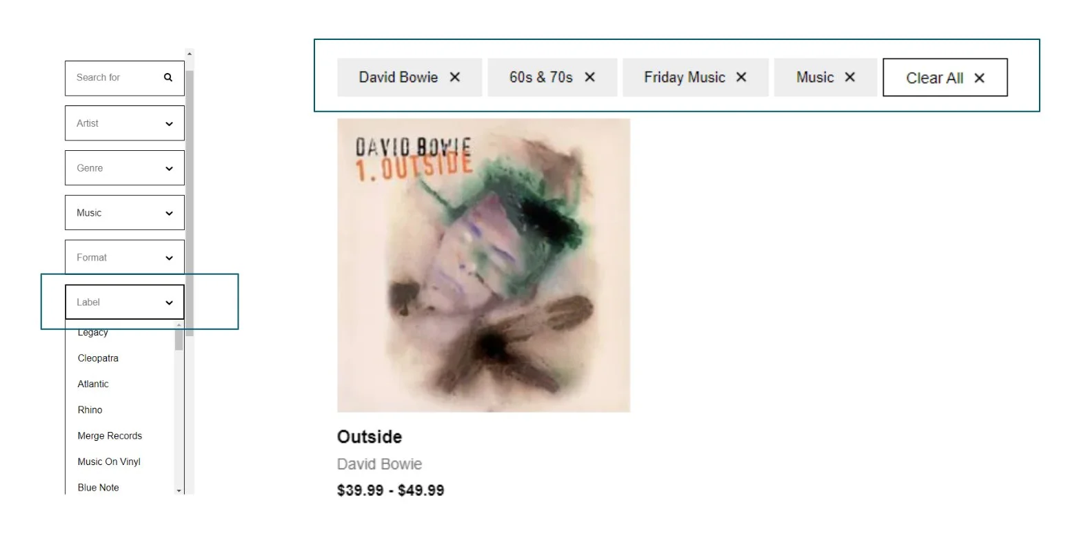
Rough Trade Filters
Tower Records Filters
Usability of the Current Site
With a general idea of how competitors handle their site structure, I prepared a usability test for Octopus Records’ current site to see where any problems in navigation might lie. Utilizing the same 4 potential users from my interviews, I conducted a moderated remote usability test. I set up a series of 6 tasks aimed at finding out how users navigate the site when searching for a specific offering as well as just browsing generally.
Usability Insights
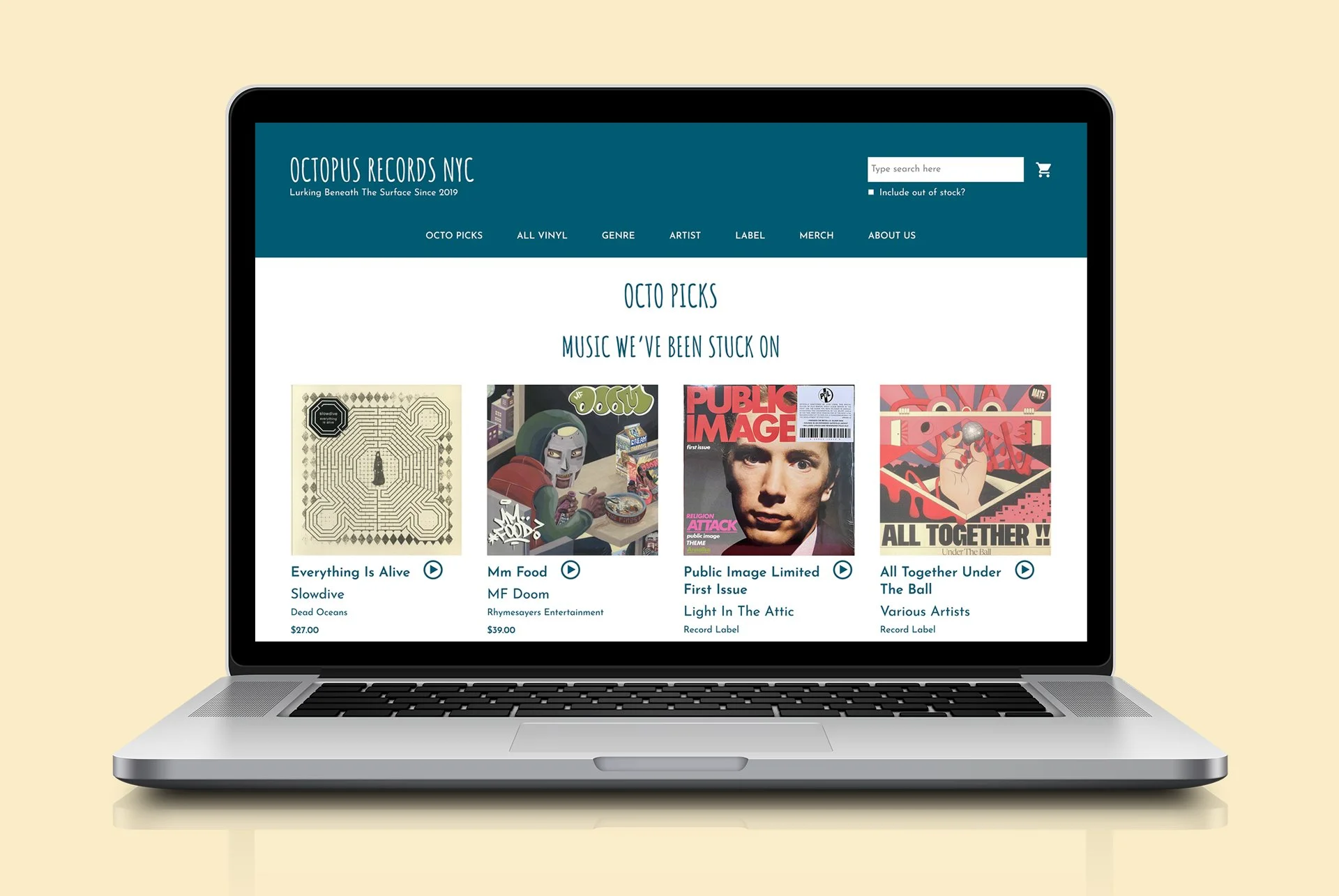
Home Page Takeaways:
2/4 users browsed shop-curated “Octo Picks”
4/4 liked having “Octo Picks” and “New Arrivals” sections on the Home Page
2/4 were confused by listing order (Artist, Album Title, Record Label)
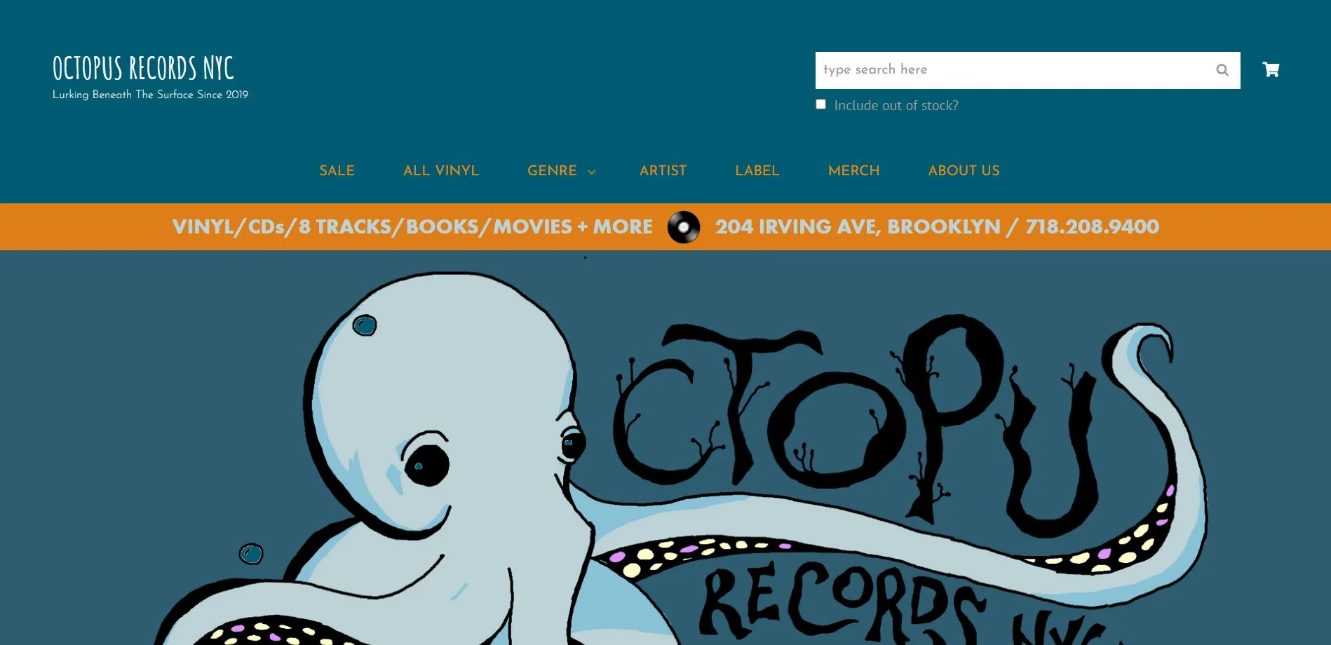
Octopus Records Home Page
Genre Menu Takeaways:
4/4 used genre to narrow search naturally
3/4 had issues navigating the genre hover menu
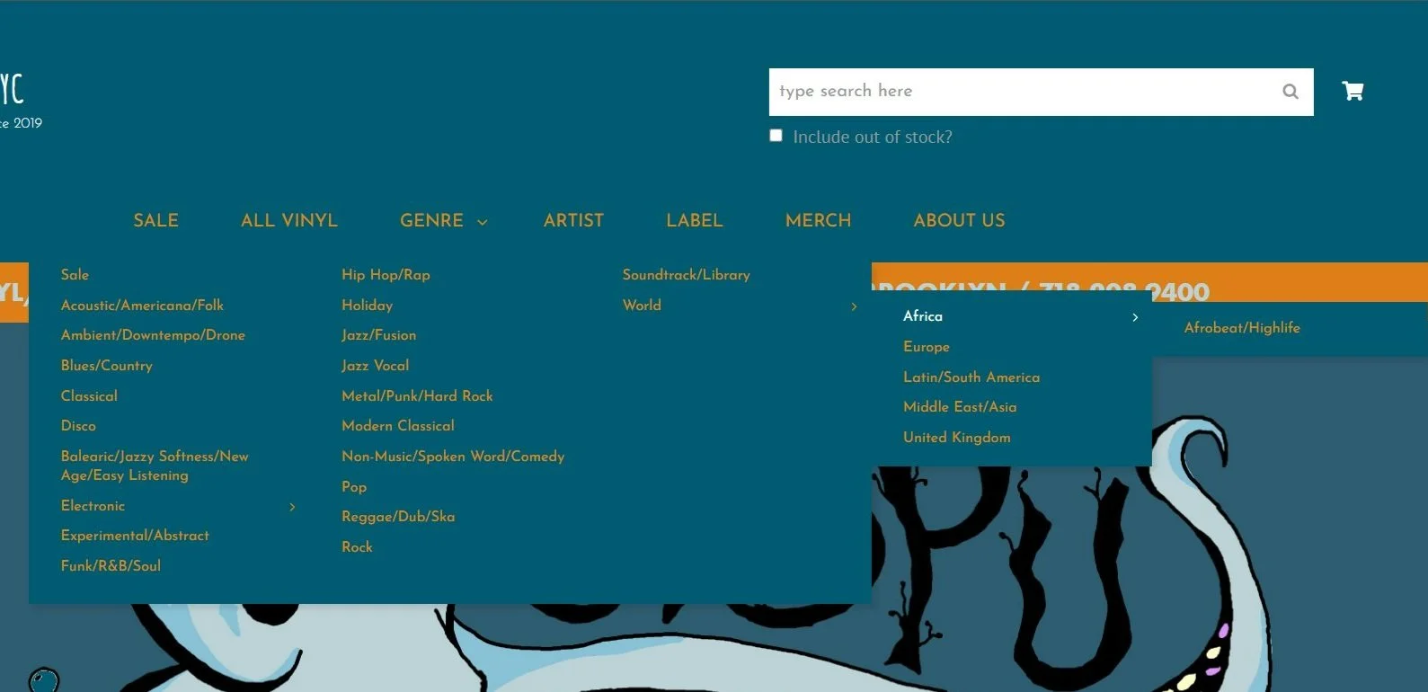
Octopus Records Genre Hover Menu
Artist & Label Page Takeaways:
4/4 were frustrated with the album and label pages having no nav options besides scrolling through hundreds of names
Product Listing Takeaways:
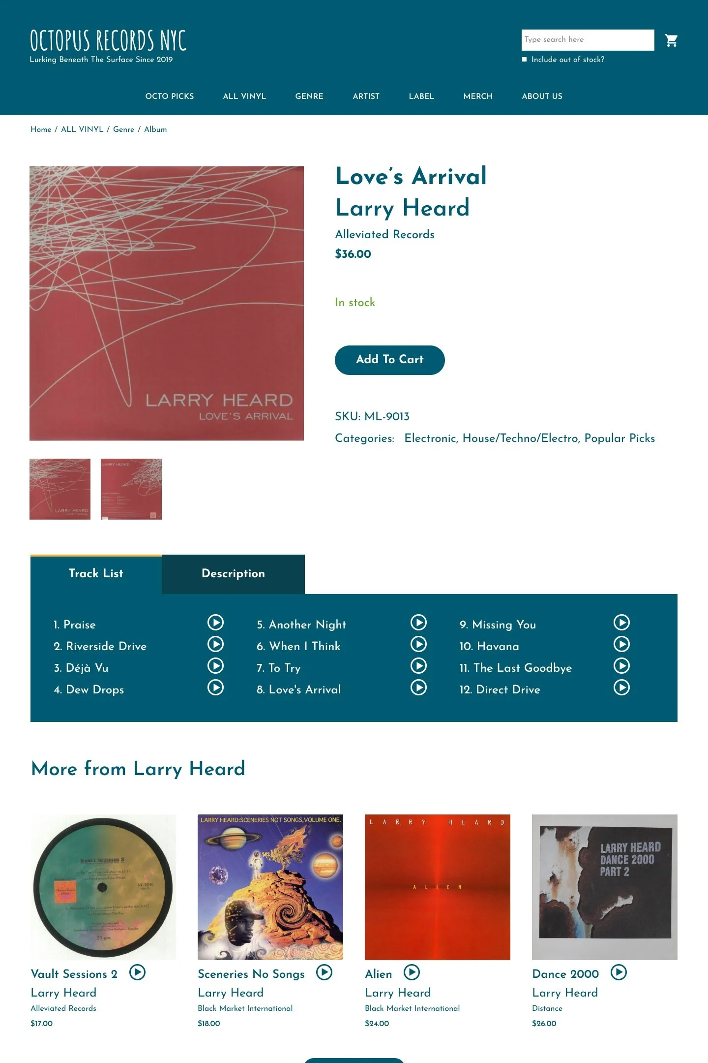
4/4 liked detailed descriptions of records, but wanted to see a track list and have some way to preview the music without leaving the site
General Site Takeaways:
2/4 commented on contrast affecting legibility
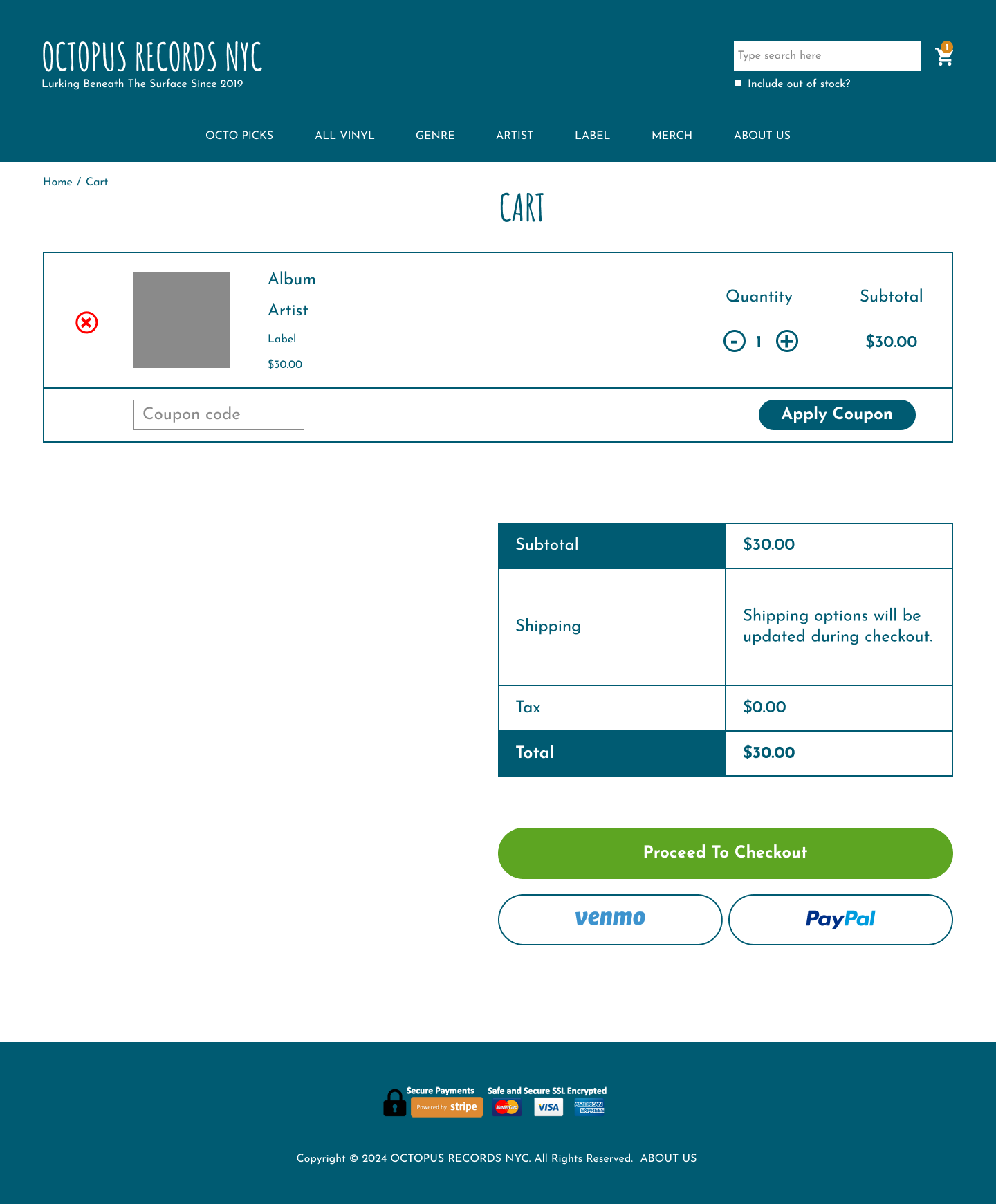
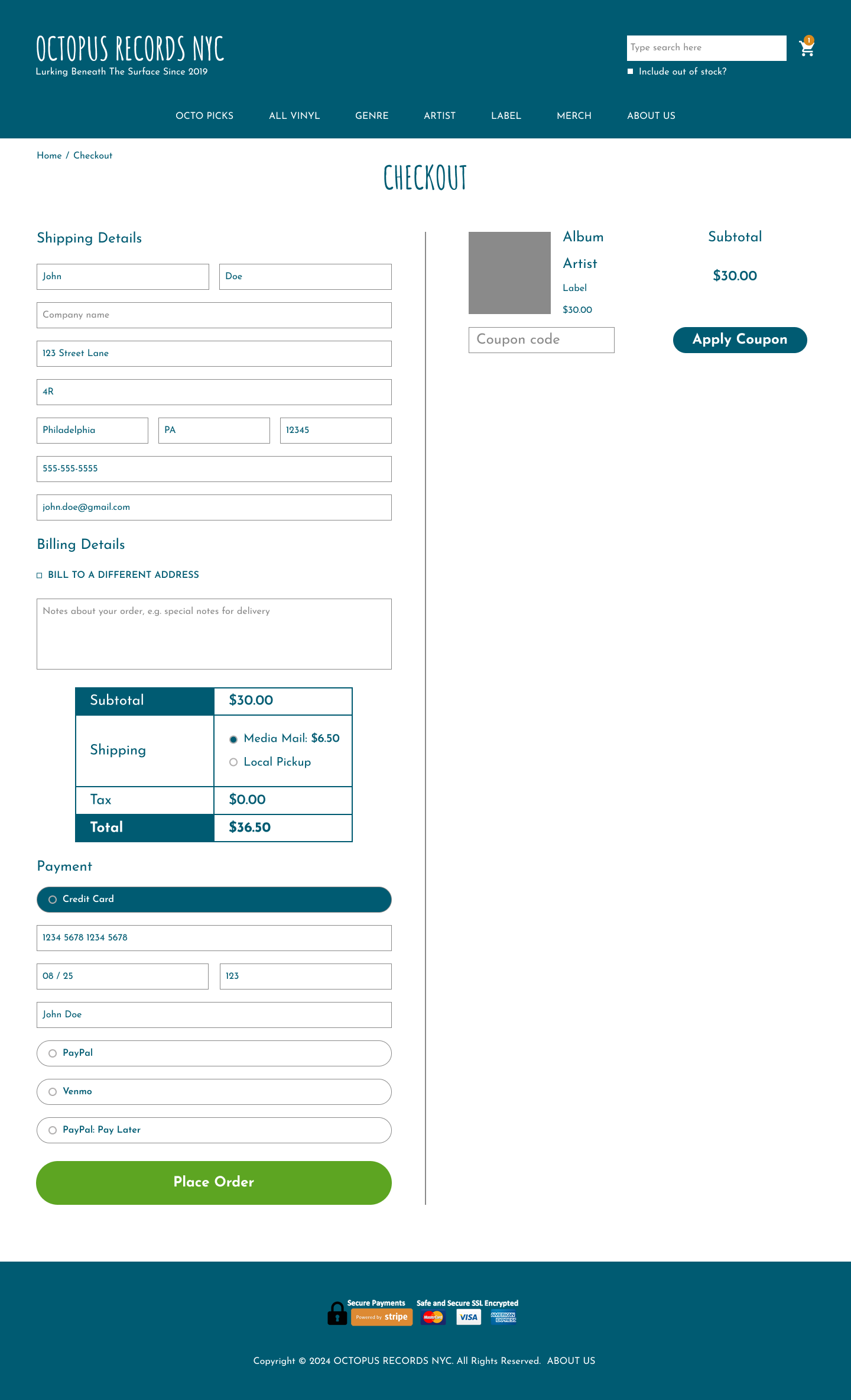
4/4 were confused by some elements in the checkout process

Octopus Records accessibility issues
Our User
Crafting A Persona
From the interviews I conducted earlier, I put together a persona that reflects the needs, frustrations, and behaviors of the typical Octopus Records patron.
Generally, there are two main shopping styles: looking for a specific record and digging for new hidden gems (typically within a genre they know they like). Since finding something specific was fairly straightforward, I focused on the new music shopping experience (which should also increase sales if a customer decides to buy additional records along with the one they came for).
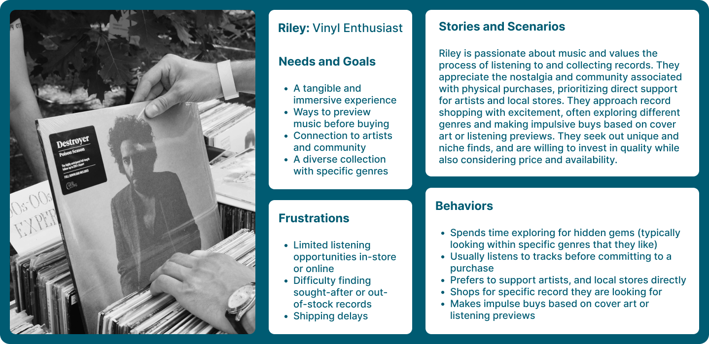
User Persona
Design
Designing For Our Persona
Our vinyl collector needs to easily navigate specific genres, preview tracks and cover art, and find similar offerings to make a purchase that brings them joy. How might we create a more immersive experience that keeps users engaged and on our site? I started with a few sketches that I later developed into mid-fi wireframes, which I ran a usability test on to see if there were any areas for improvement before finalizing the designs.
Some issue that were found were:
3/4 users were uncertain of the play feature and 2/4 users thought that it could trigger a dropdown menu.
2/4 users scrolled to the website footer to look for store hours.


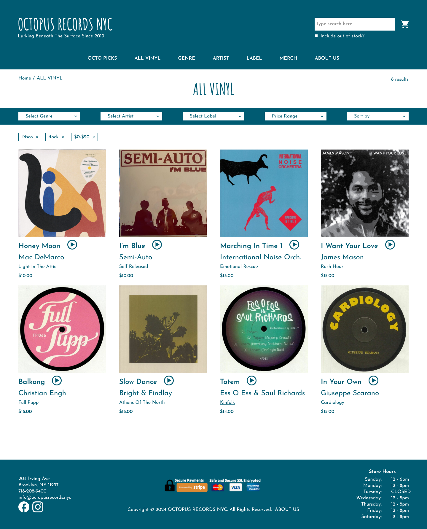
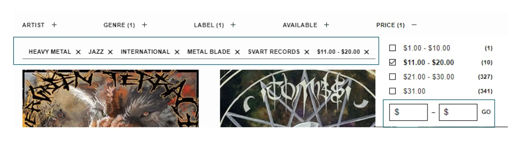
With those issues in mind, I redesigned the main landing pages for Octopus Records’ site. The main areas of improvement I focused on were:
Preview feature with clearer icons and tracklists
Accessibility issues with contrast and unclear checkout symbols and prompts
Revamped Artist/Label pages to allow alphabetical sorting while retaining the in-person feel of flipping through crates
Stackable filtering options for searching the entire inventory by genre, artist, label and price
Below are some hi-fi frames of the final design: