WEVOLV Desktop Dashboard Redesign
This project was a collaborative effort between members of our UX team, with feedback from the founders of WEVOLV

Project Overview
Scope
UX Team: Conor Lockier, Bess Gaby, Alexa Mirageas, Tehila Nissanian
My Role: HiFi Prototype Lead, General UX Research and UI Design
Timeline: 2.5 weeks
Their Problem:
Current service provider users are feeling disconnected from the content they upload to their pages and are considering abandoning the platform. They are struggling to connect with potential clients.
Our Solution:
A redesign of their service-provider-facing dashboard to better reflect how their content appears to athletes on the WEVOLV mobile app.

Brief
WEVOLV is a networking platform focused on connecting professional athletes with service providers in the sports industry (personal trainers, sports therapists, financial advisers, etc.), teams, agents, and unions. They offer contract and other sports-industry-related analysis and support, with the goal of empowering the global athlete community through resource sharing and transparency in the industry.
Before our initial meeting with our client, we were given a list of potential priorities, but service provider onboarding and profile creation were flagged as the most pressing. Currently finishing their basketball season abroad, the WEVOLV founders were unable to touch base before our initial meeting; we had to familiarize ourselves with the industry with the competitors they provided.
Research
Learning the Playing Field: Competitive Analysis
The WEVOLV team highlighted the service provider onboarding process as their top priority, so our team focused our competitive and comparative analysis on those features from the list of competitors given. WEVOLV draws from several elements across different platforms (business networking, talent-seeking and recruitment, community building and content sharing), so we had a broad list of competitors to analyze:
Direct Competitors:
Uru Sports, Mighty Networks, & Circle.co
Indirect Competitors:
LinkedIn, Instagram, & TikTok
We began with analyzing the onboarding process that their direct competitors utilized - from visiting their homepage and stating their value, to guiding users to sign up for their service. Later in our process, our priorities shifted to revamping their profile creation flow and complete overhaul of their desktop dashboard (I’ll expand on this later), so we also analyzed these aspects of their competitors.
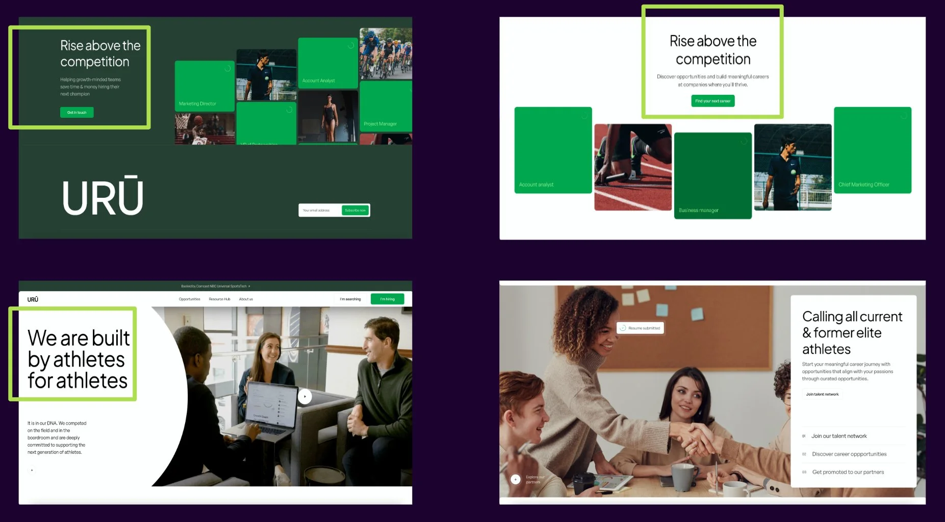
Uru Sports’ onboarding - value propositions and calls to action
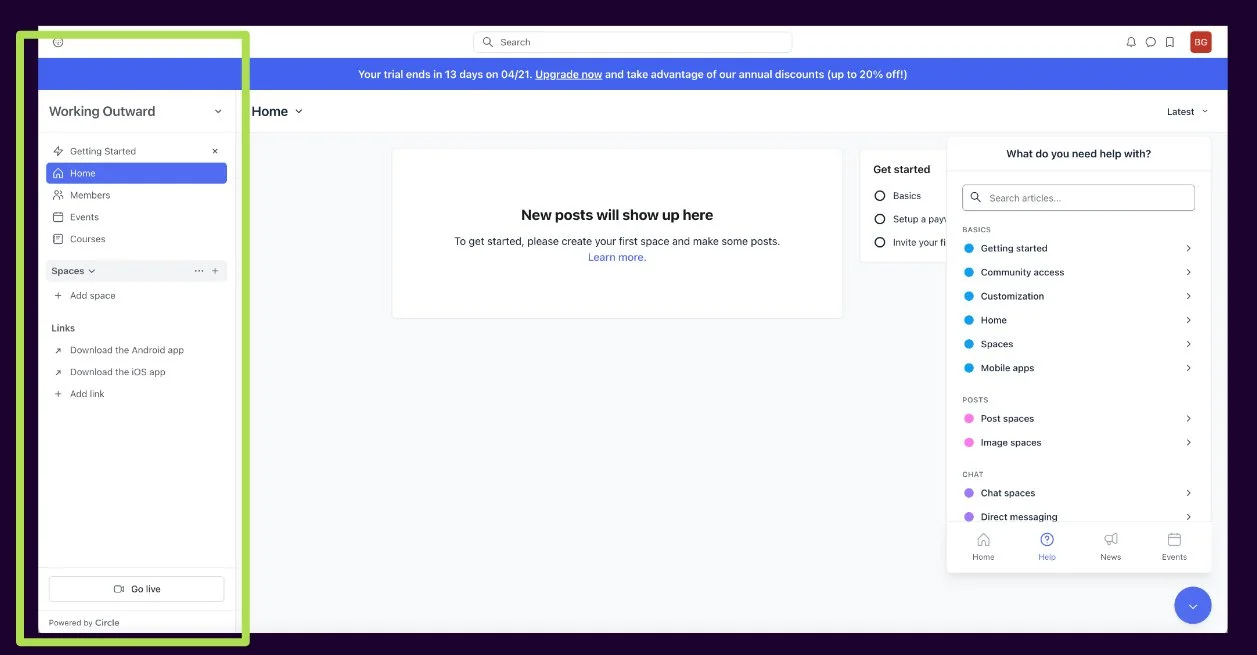
Circle.co’s dashboard layout and onboarding
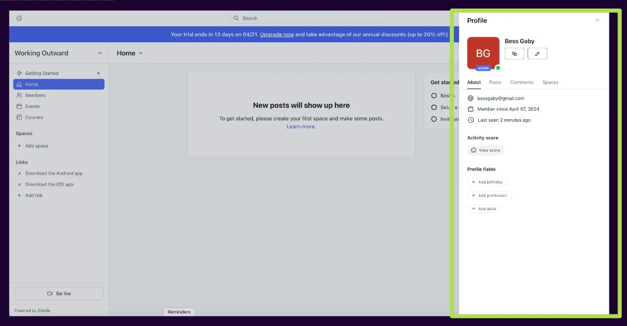
Circle.co’s dashboard layout and profile editing
We focused on the features highlighted, language used, prompts, and general presentation and ease of use. To get a better idea of what exactly would benefit the platform’s users, we moved on to interview current service providers that have signed up for WEVOLV’s services.
On-The-Field Interviews
To understand the experience in marketing their services, our team conducted 3 interviews from a list of current, pre-approved WEVOLV service providers. Ideally we would have interviewed more clients, but given the limited pool of users, time constraints, and various time-zones of their global userbase, 3 would have to do. From our initial meetings with WEVOLV, we learned that trust, engagement, and community were 3 important value propositions that the platform aimed to provide to service providers. In our interviews, we wanted to understand how service providers currently attain that value outside of WEVOLV so that we might be able to better facilitate these interactions within the platform.
You can look over our interview script here if you’d like.
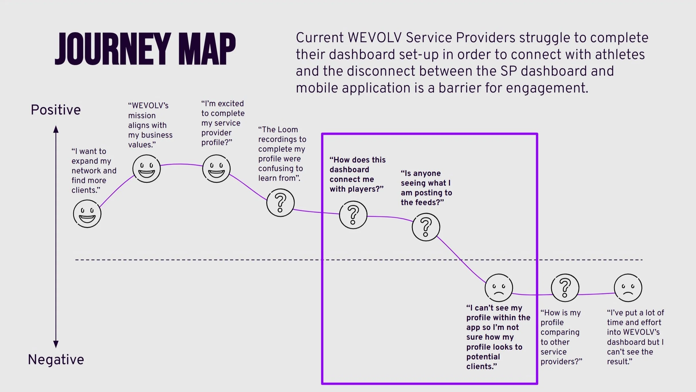
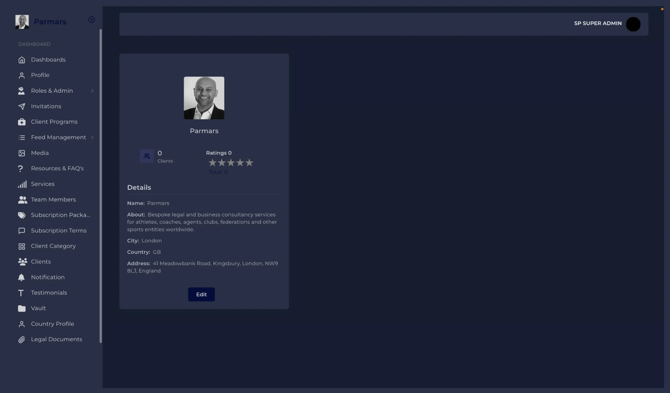
Throughout these interviews we found that these current users were struggling with the dashboard, feeling uncertain about the completeness of their profiles and unable to see how they appeared to the athletes they were hoping to engage with (who were viewing them on the WEVOLV app, which is available only to athletes). This lack of visibility raised concerns about their competitiveness on the platform and led to infrequent engagement - potentially leading to abandonment.

Original Dashboard Profile Page, which felt disconnected from the app
Pivoting Priorities
After learning of current users’ pain points with the current dashboard experience, we returned to the WEVOLV team to discuss their predicament; although improving the onboarding process might increase the userbase and alleviate some of the confusion concerning the current dashboard, we felt that onboarding new users to a product that was at risk of abandonment would be a wasted effort. There was a fundamental disconnect between the current interface and what potential clients were seeing on the app.
Instead we shifted our priority to improving the experience of the service provider dashboard through a redesign of the interface that connects users with their profiles and facilitates connections with clients.
Our User
After compiling our interviews and research, we began to create a persona for a potential WEVOLV service provider, Alex.
Alex has been working as a professional service provider for several years now, offering life coaching services for the past two years. Alex is passionate about helping clients navigate complex emotional challenges and has recently started prioritizing athletes as a target market for their services. They are currently using Linkedin to network within their service provider community as well as market their services:

To understand how service providers were currently navigating and adding content to their profiles and community feeds, and engaging with the athlete community, Bess and Tehila created a site map of the dashboard. Each piece of navigation has one singular use. To understand how service providers were currently navigating and adding content to their profiles and community feeds, and engaging with the athlete community, we created a site map of the dashboard. For the most part, each piece of navigation has one singular use:
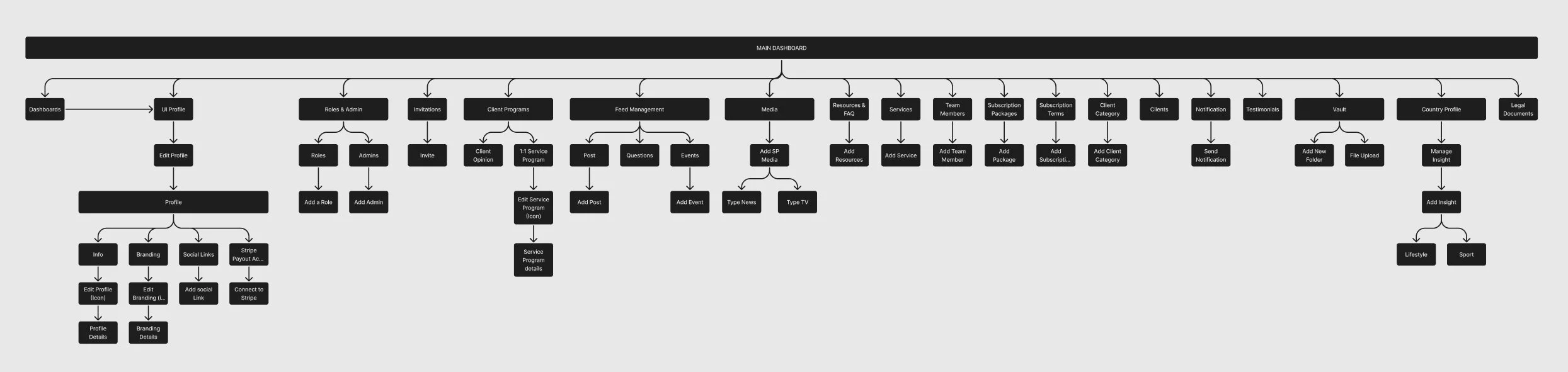
Original Dashboard Site Map
Following this, we designed a tree test to evaluate the functionality of the current Site Map, aiming to validate our findings for the new site map. We had participants carry out 3 tasks:
Where would you update the “About” section of your profile?
Where can you find questions from the athlete community?
Where can you list your company’s services?
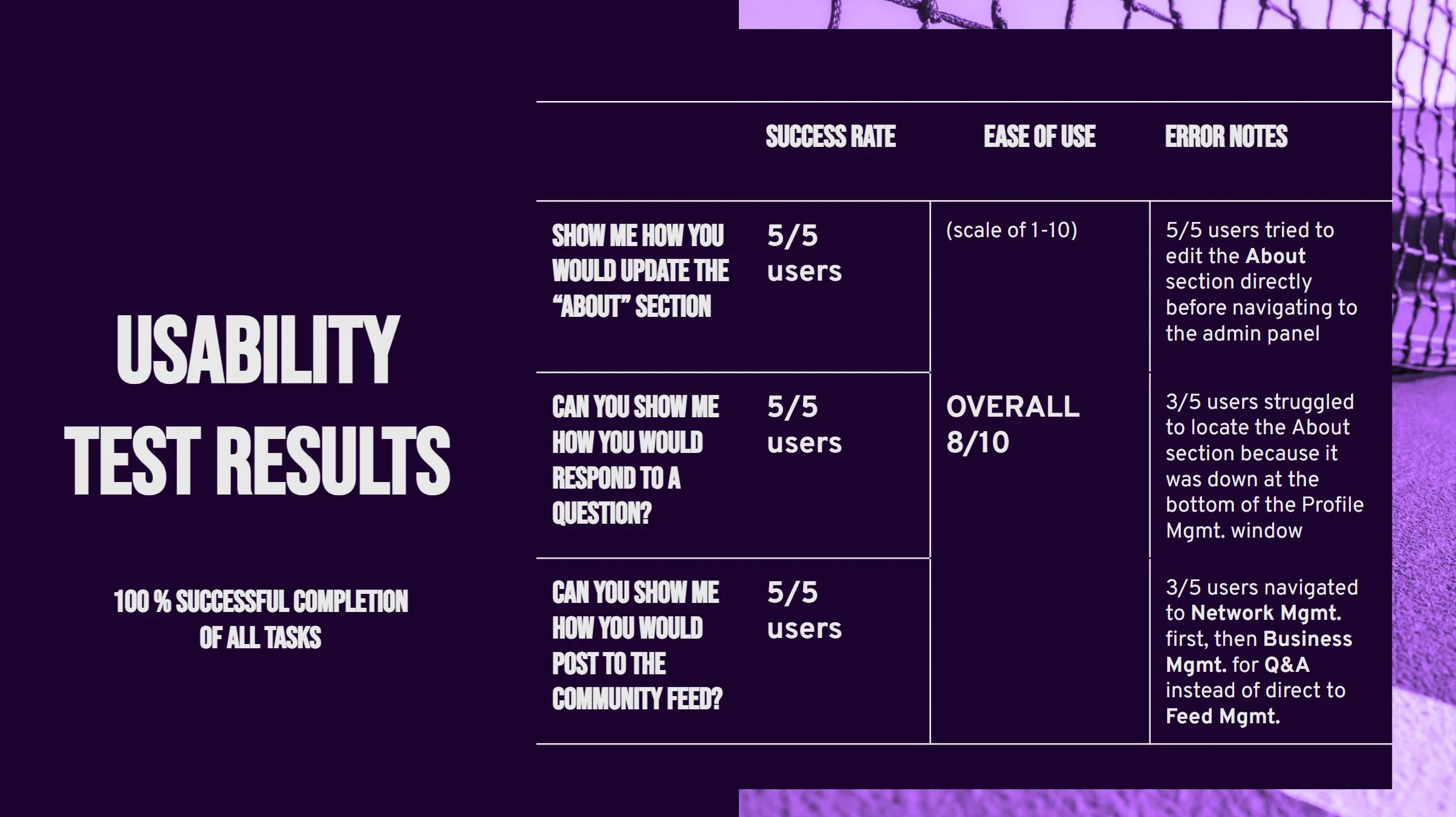
Our study involved 21 participants, The overall success of each participant completing the given tasks was 62%, and the overall directness when completing tasks was 68%. The average completion time for each task was 19.35 seconds. Based on these outcomes, we realized that participants encountered some challenges in picking the correct path to fulfill these tasks.
By integrating findings from the tree test and our firsthand experience navigating the existing mobile application, we formulated a revised site map. The objective of this new site map was twofold: to enhance the clarity of dashboard navigation functionality and to boost engagement with end-users via the mobile application. This was achieved through optimizing user flows to align with the mobile application's functionality and renaming these flows and functions accordingly:
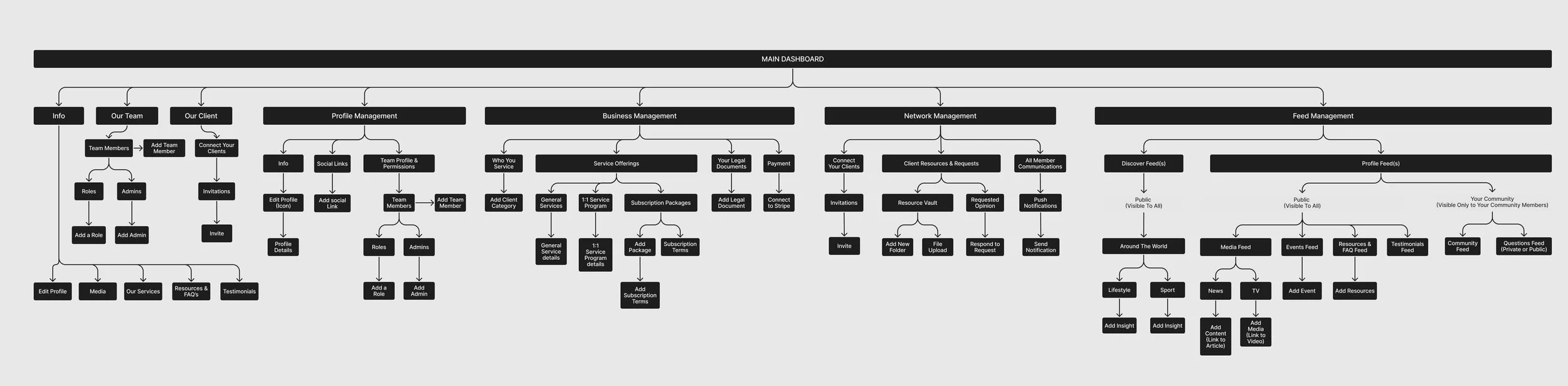
Our design blueprint aimed to incorporate a visually intuitive representation of the dashboard, mirroring the information of the mobile application. By adopting the same language utilized in the mobile application within the body of our Dashboard, we could effectively convey to service providers how athletes perceive their profile page.
Design Solutions
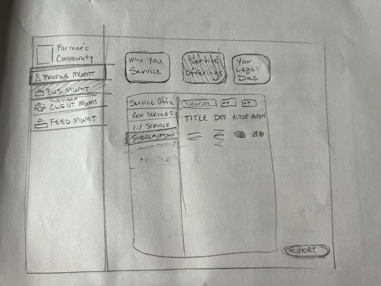
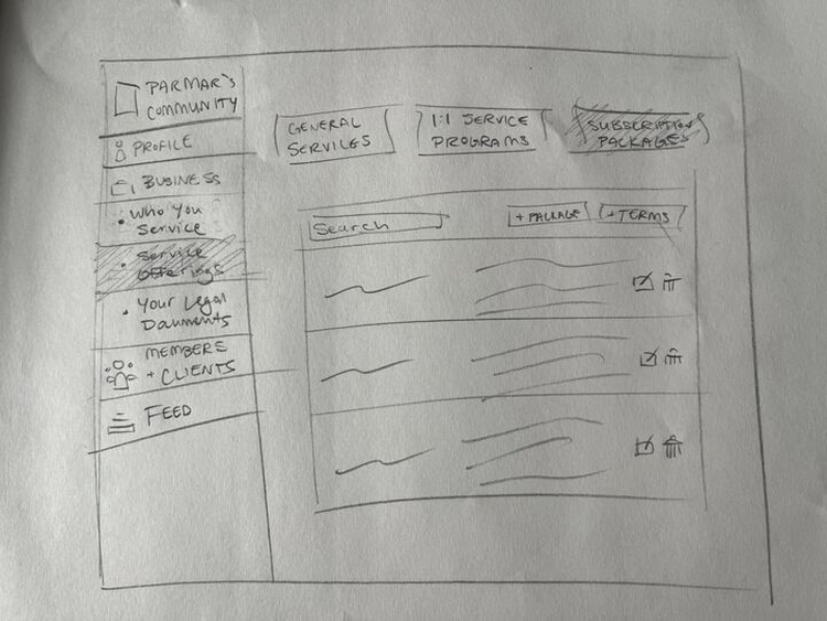
To save on time, while Bess and Tehila were starting the site map revisions, Alexa and I began sketching some potential design layouts to expand on in Figma. I focused on drawing layouts based on the profile creation pages seen in our competitive analysis, primarily Circle.co’s use of sidebars and overlaid editing fields:
Moving on to wireframing, we wanted a dashboard experience that reflected the functionality of the mobile experience to instill trust and transparency. We designed our Home Page wireframe to reflect the view that athletes have of the service provider from their mobile app by including the same format, layout and accessible resources.
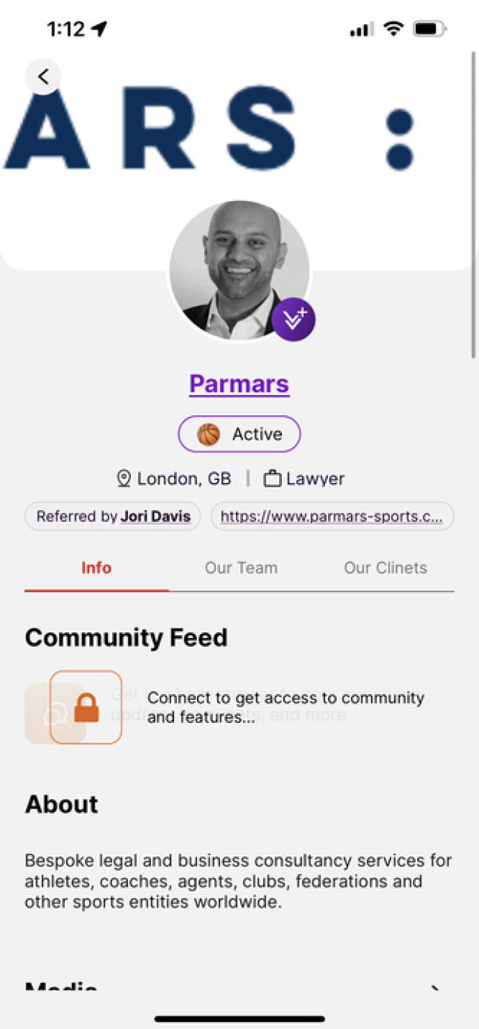
Mobile App Profile Page

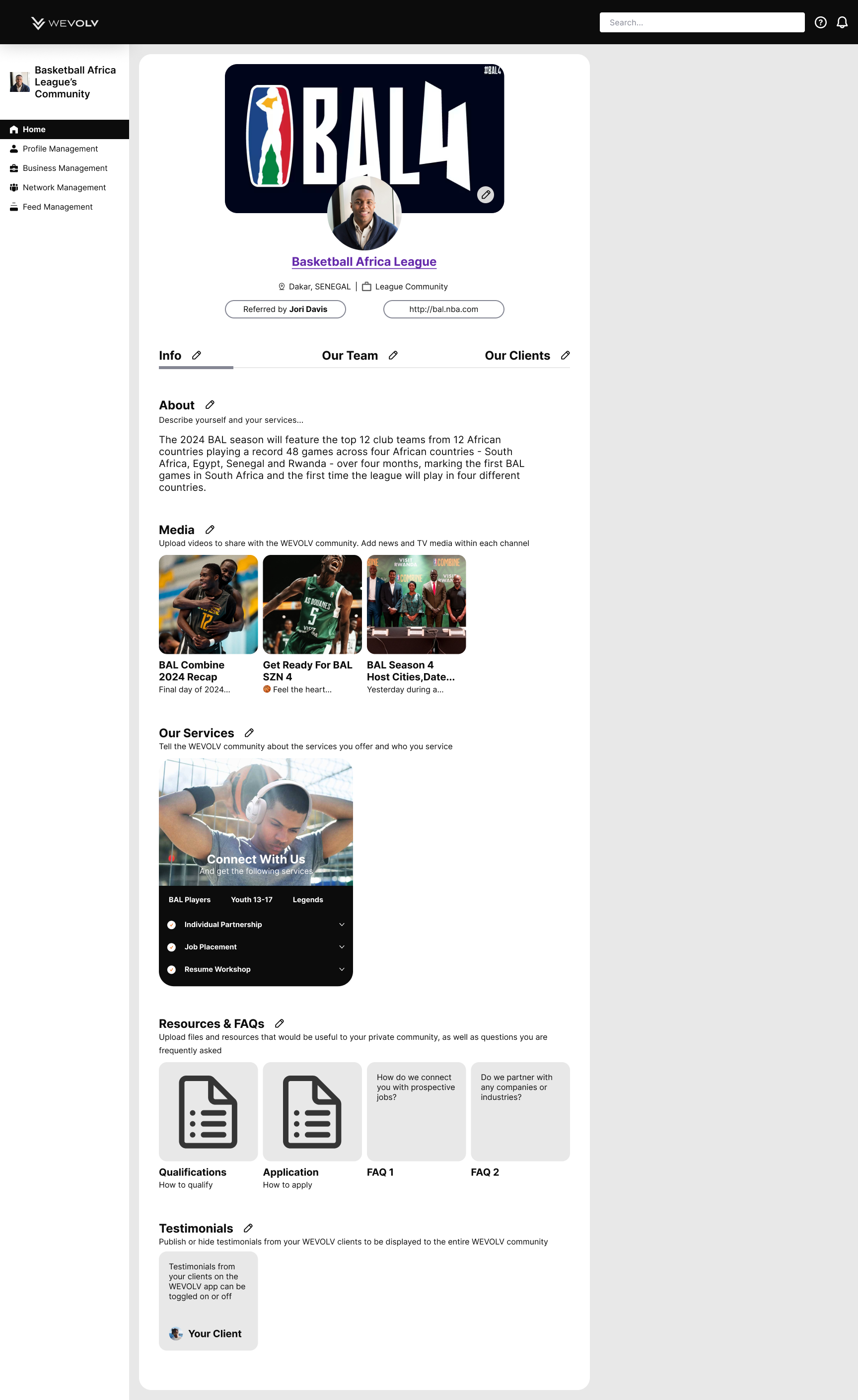
Redesigned Dashboard Profile Page to reflect App layout
Since the main concerns of the users we interviewed were regarding their profile setup and client interaction, those are the main flows we focused on in our prototype mockup. For each, we utilized a pop up overlay rather than the current redirection to a new page so that users could see how their profile edits would look as they edit, as well as reference any posts from clients as they responded. Feel free to look over some more detailed wireframes below:
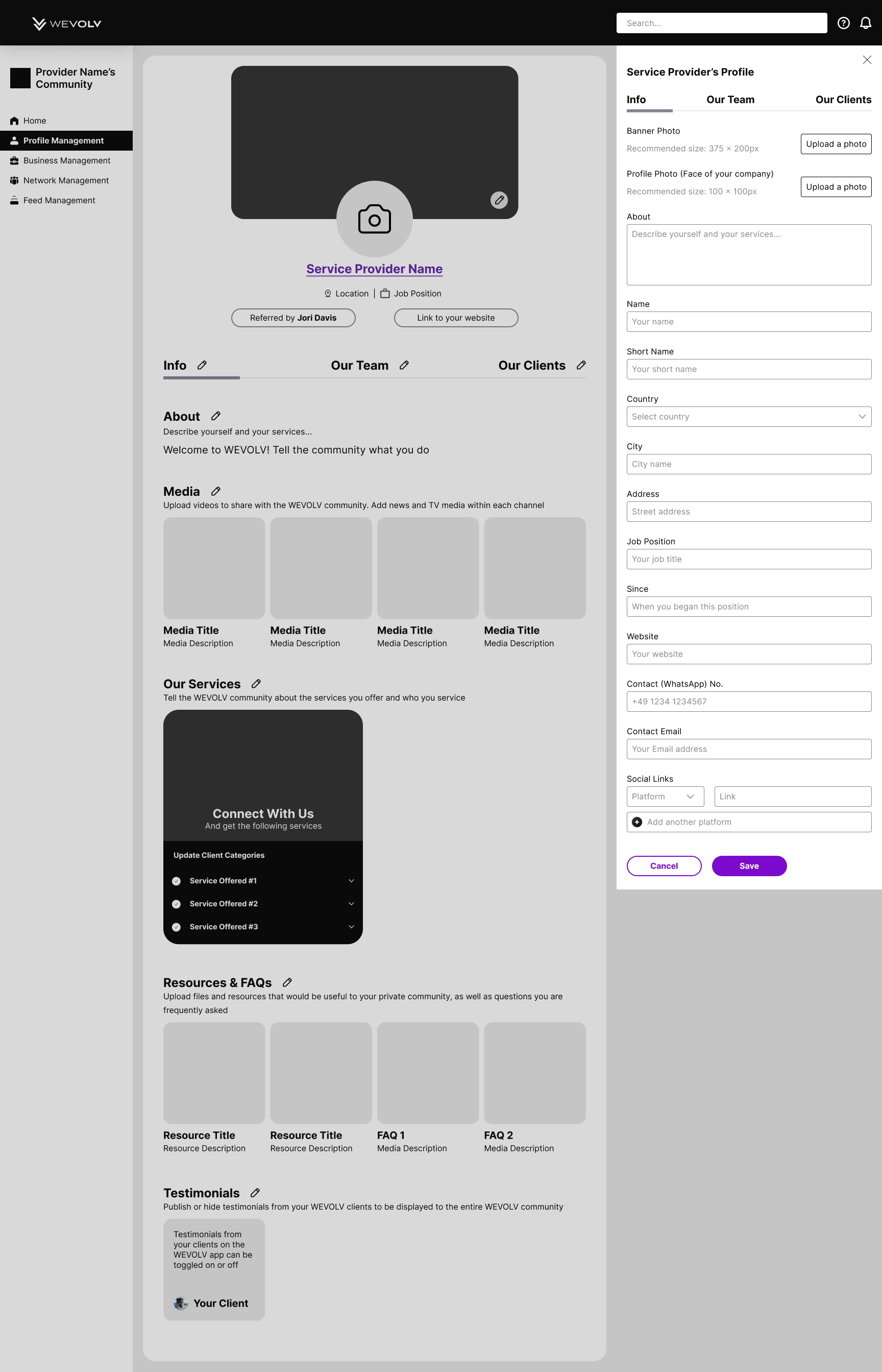
Redesigned Profile Page edit overlay
Redesigned Profile Page completed
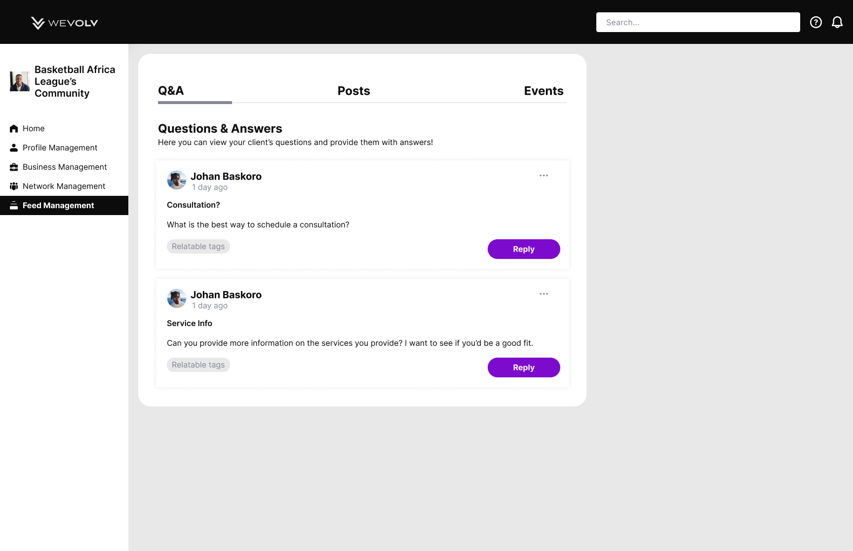
Redesigned Q&A Page under Feed Management
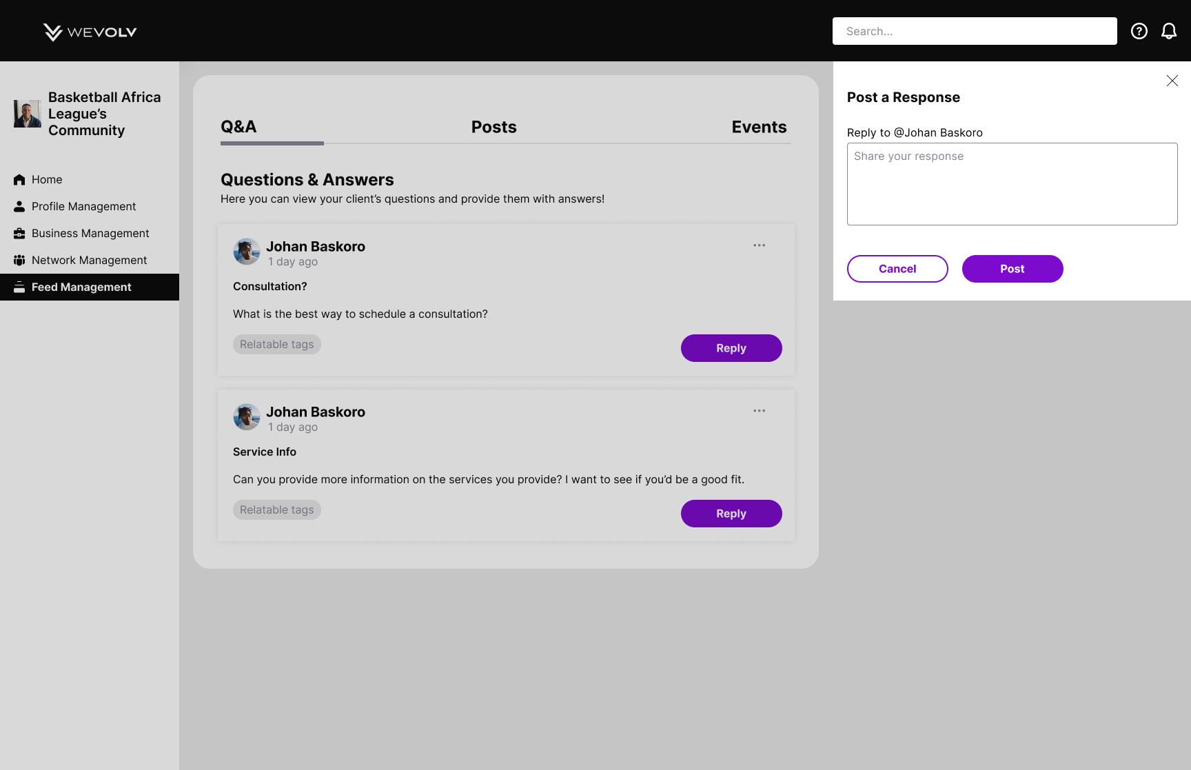
Redesigned Q&A reply overlay under Feed Management
Results
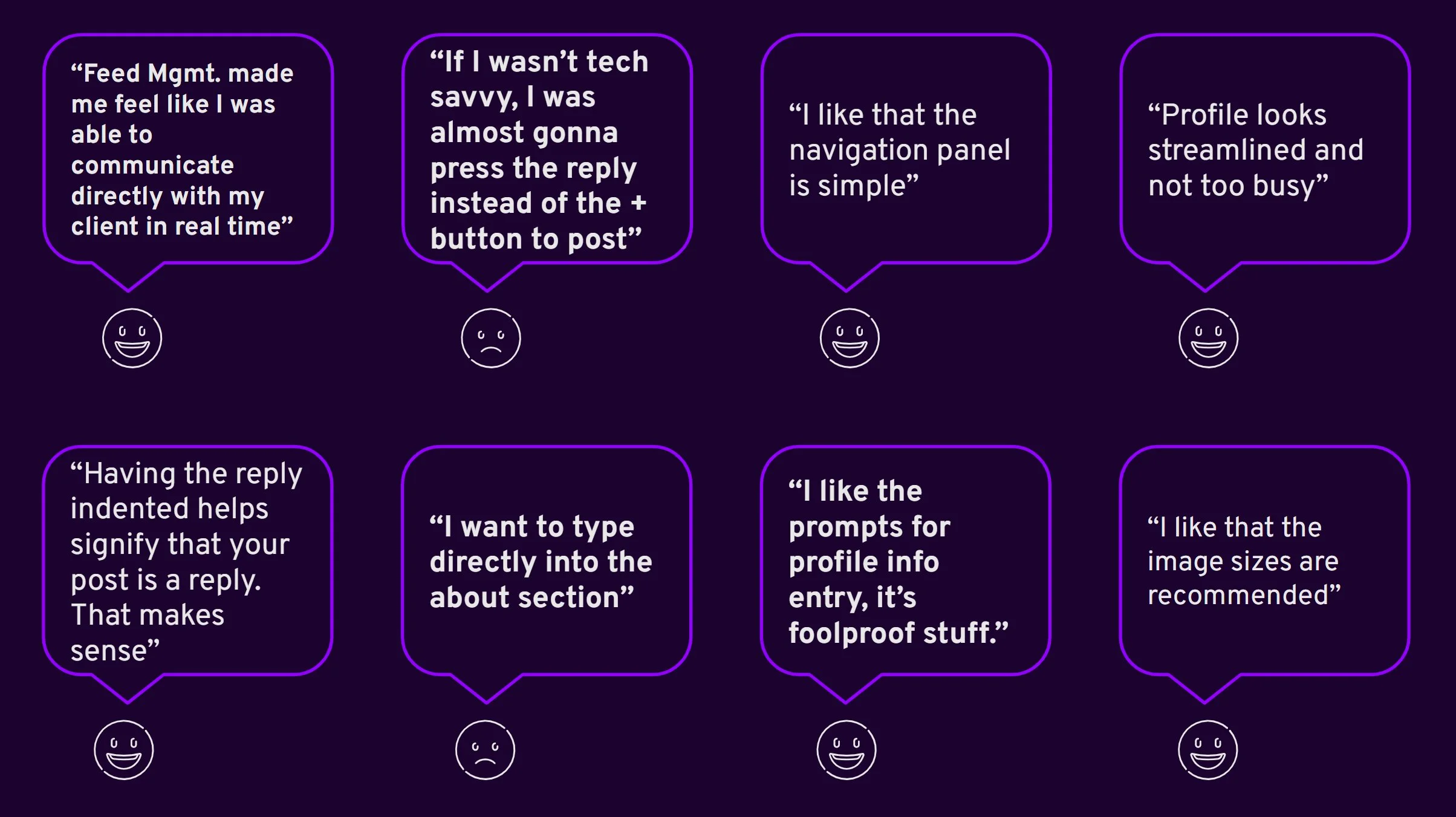
Usability Testing
We tested our prototypse with 5 participants. Our objective was to determine the effectiveness of the updated dashboard navigation. Our measures for success were task success rate and ease of use.
During our test, we asked our participants to update the about section of their profile, to respond to an athlete inquiry, and post to the community feed.
You’re welcome to try completing these tasks yourself in the prototype below:
Next Steps
Overall our results were positive, with a few hiccups that we addressed in our final mockups. From here we suggested a few actionable steps for the WEVOLV team to consider based on our research and their initial brief:
Chat Feature - Private Messaging
Customer Success Agent and updated tutorials & guides to support the service provider experience
Service Blueprint to support the onboarding process
Prioritize the ‘Testimonials’ section within the design of the current mobile app